APP DESIGN | RESEARCH & DESIGN
Research and Design of a Church Mobile App

Members want to be part of a church that provides connection, relevance, growth, and convenience, but feel disengaged because Providence lacks the digital tools to meet their different needs and stages of faith.
Client
Providence is a contemporary, multicultural church based in Brisbane. The church is still in its early years and currently meets in a local school. Its congregation is made up primarily of young working adults, many of whom are regular attendees and volunteers, alongside newcomers. The church has around 80 regular members and is supported by three paid staff members.
Background
I led the design for a faith-based mobile app to centralise communications and event planning for Providence Church. While the original scope included full functionality across sermons, groups, giving, and volunteering, the focus was strategically narrowed to the events feature due to time constraints. This MVP was chosen strategically based on user needs, and designed in a way that scale into a full app ecosystem in future phases.
The Challenge
Providence Church faced several digital challenges:
Fragmented communication across multiple platforms.
A dated and underused website.
Limited tools for coordinating events or volunteering.
Newcomers found the online presence confusing and unwelcoming.
Regular members and volunteers struggled to stay informed and organised.
“There are many different platforms that we do utilise... that can get confusing.”
User Feedback
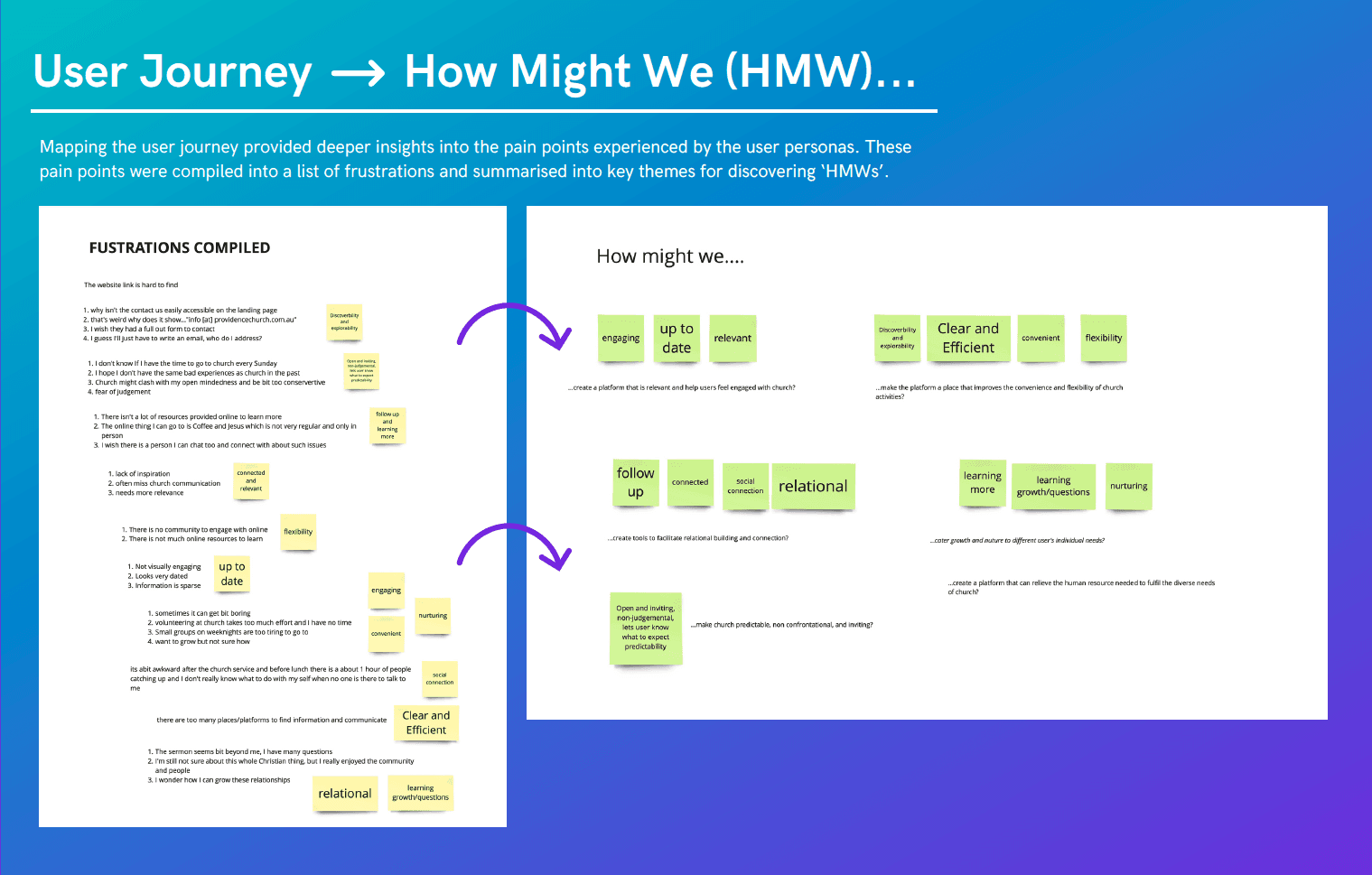
The entire service experience of the different user groups was mapped out to uncover key opportunities.

Opportunities
Establish a unified mobile experience for newcomers, regulars, and volunteers
Make it easy to discover and register for events
Build a scalable design foundation for additional features
Reflect the warmth and relevance of the church community through design
I conducted user research for two key reasons. First, as a not-for-profit working with a limited budget, we needed to determine which features were essential to prioritise for the initial release. Second, I wanted to validate (or challenge) my assumptions about user frustrations and opportunities, so we could confidently focus our efforts on solving the right problems.
Research Methods
Competitor Analysis / Exploratory interviews / Contextual Inquiry / Usability Testing / Affinity Map / Personas / Card Sorting
Interview and Contextual Inquiry
Members of Providence Church were interviewed and asked to explore the existing website to observe their experience and uncover pain points and opportunities in the church’s current digital presence.
Insights
Through affinity mapping, I synthesised insights into key themes that consistently emerged across interviews:
Irrelevance: Members felt the current digital presence lacked usefulness and relevance to their needs.
Confusion: The use of multiple communication platforms left users uncertain about where to find the latest news and events.
Convenience: Busy working adults wanted quicker, easier access to essential information.
Community: Newcomers felt unsure about available programs and what to expect when attending church.
Productivity: Volunteers desired simpler tools for rostering and planning their involvement.
Inspiration: Members were seeking resources that could support and enrich their faith journey.
These identified themes formed the foundation for developing user stories.
“As a regular member, I want to easily find what’s happening in the church life without jumping between platforms.”
User Story (one of many)
Preliminary features
Using the themes and user stories gathered from the affinity map, along with insights from the competitor analysis, initial features were ideated to inform potential touchpoints of the product.
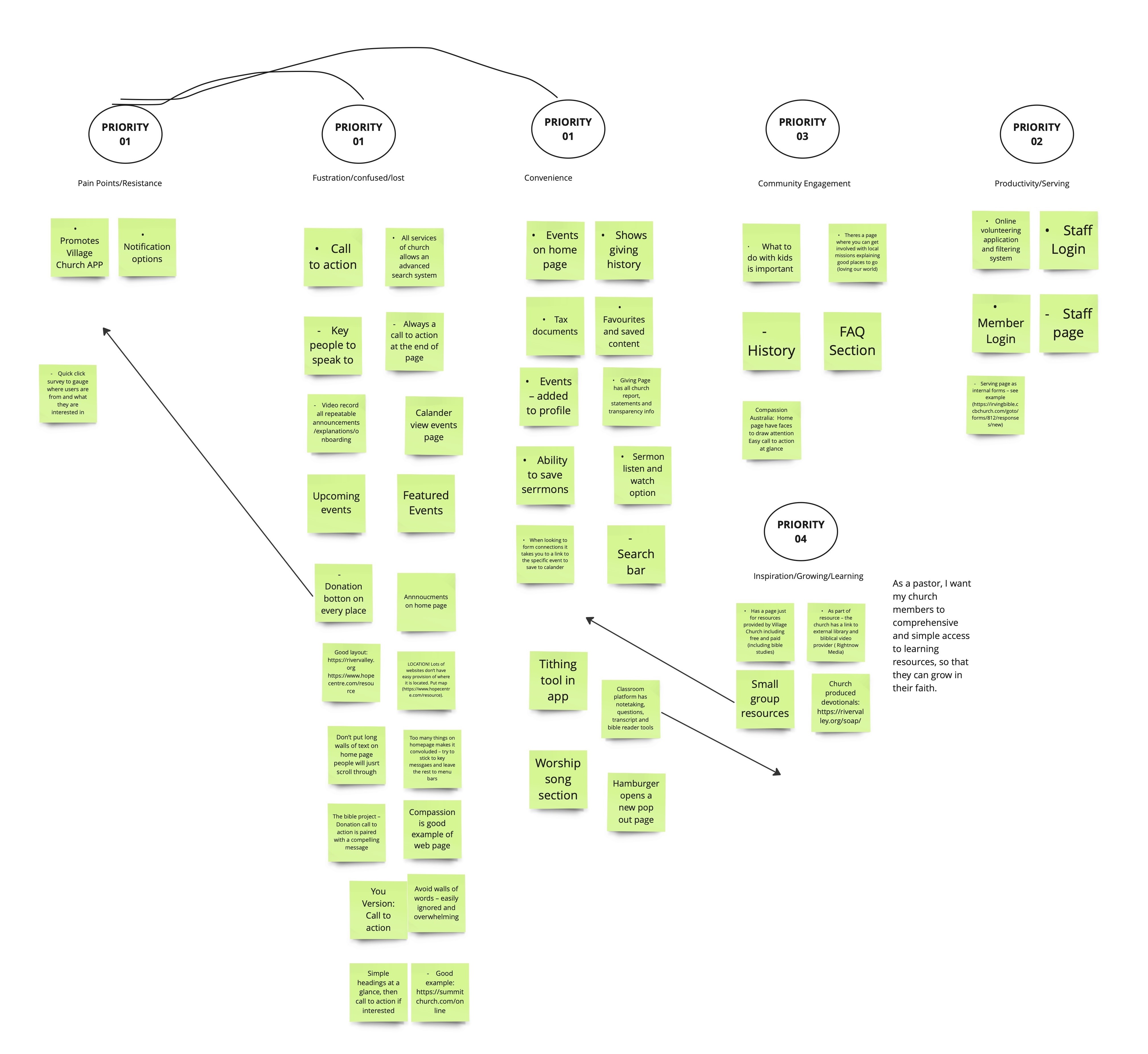
Key themes from user frustrations were used to craft 'How Might We' statements aimed at addressing core challenges.
Events as the Minimum Viable Product (MVP)
The original brief was to design a full-featured app including events, sermons, giving, groups, and rostering. However, after consulting with staff, the focus shifted to Events, identified as the highest priority based on organisational needs.
The MVP was shaped by these main priorities:
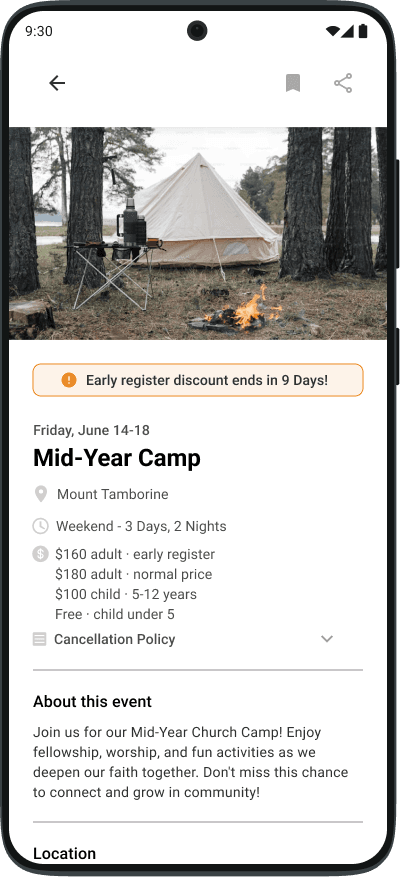
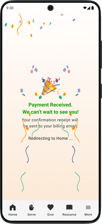
Discover upcoming events
RSVP and view event information
Save events to calendar
View bulletins and announcements
Scalable information architecture and design system
While the MVP focused on events, the app was built to support future modules like sermons, giving, and small groups, allowing the product to grow alongside the church.
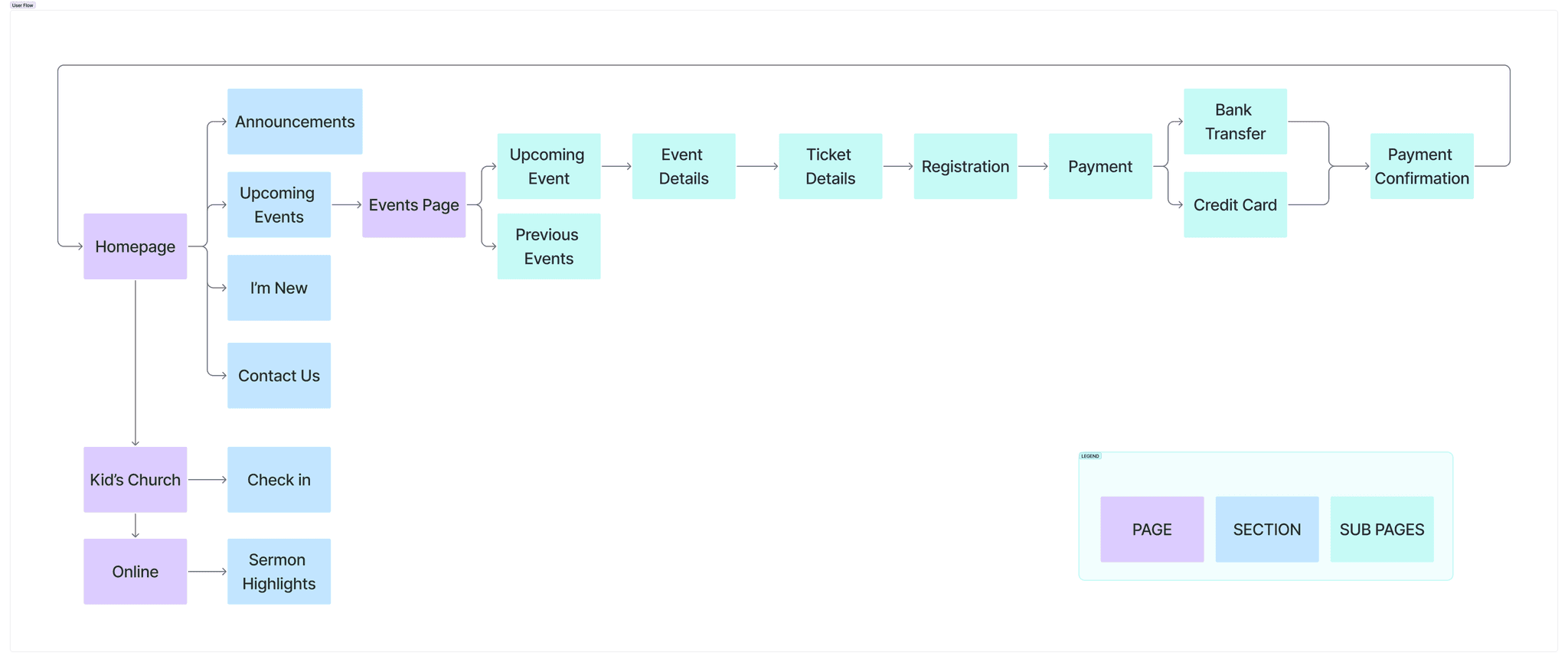
Guided by the preliminary features and 'How Might We' statements, a set of pages was developed for the Events MVP. These were then organised into a user flow, forming the foundation for the wireframing process.
Defining the event sign-up user flow as the minimum viable product.
Wireframing and testing
The user flow guided the creation of initial wireframe sketches, which were user tested using pointing and hand gestures. Feedback from users was documented alongside each component for reference and iteration.

Building the wireframes based on the user flow.

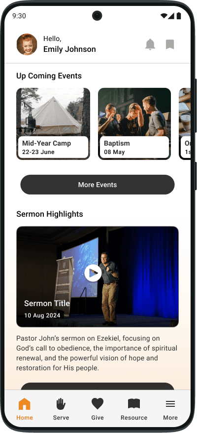
Expanded wireframes illustrating how the app can scale with additional features.


Outcome
Created a scalable design ready for future app phases.
Validated product-market fit through user testing with strong qualitative feedback.
Short-term goal
Test and refine additional features and gather staff feedback on backend integration.
Long-term goal
Partner with staff to implement the MVP and allocate budget for its development, with a longer-term goal of expanding into communication tools and personalised content delivery.