WEB DESIGN | DESIGN TEAM
Interface Redesign for a Government Consultancy Website

The Problem
Prospective candidates, partners, and clients seeking 1448’s services want assurance of their reputation and credibility through evidence-backed results. However, 1448’s current website provides minimal proof of their services, core values, or unique value proposition. Coupled with ambiguous branding and a subdued digital presence, this lack of clarity leads users to hesitate in trusting 1448’s ability to meet their needs.
Client
1448 Agency is a Canberra-based consultancy delivering business and transformation outcomes across the government industry. Their expertise spans advisory services, digital transformation, workforce planning, and more.
Role
As part of a design team project for 1448 Agency, I was responsible for the UI design, focusing on information architecture, visual clarity, and WCAG-compliant design. My goal was to translate user research insights into a website that communicates credibility, builds trust, and scales with the organisation's future goals.
The Challenge
Despite 1448's strong record, the agency’s digital presence did not reflect their credibility or scale. The website redesign aimed to improve brand visibility, build trust, and better support lead generation and strategic partnerships. Some key challenges include:
The current website lacks clarity around what 1448 does.
It is not optimised for SEO and performs poorly in terms of content discoverability.
There is no clear narrative connecting the service offerings, making it hard for users to understand 1448’s value or find relevant information.
"We knew our website needed a major overhaul. With limited internal capacity and a legacy site that hadn’t evolved over many years we had a lot to do, however wished to broker some support."
Director of Sales and Partnerships, 1448 Agency
Opportunities
Clear offering: Communicate 'who we are', 'what we do', and 'what makes us different'
Build trust: Present a professional and modern interface that reflects credibility
Support lead generation: Help convert interest into conversations or opportunities
Content sharing: Make case studies and insights easy to share for growth and marketing
Ensure accessibility and inclusion: Meet accessibility standards and use inclusive language
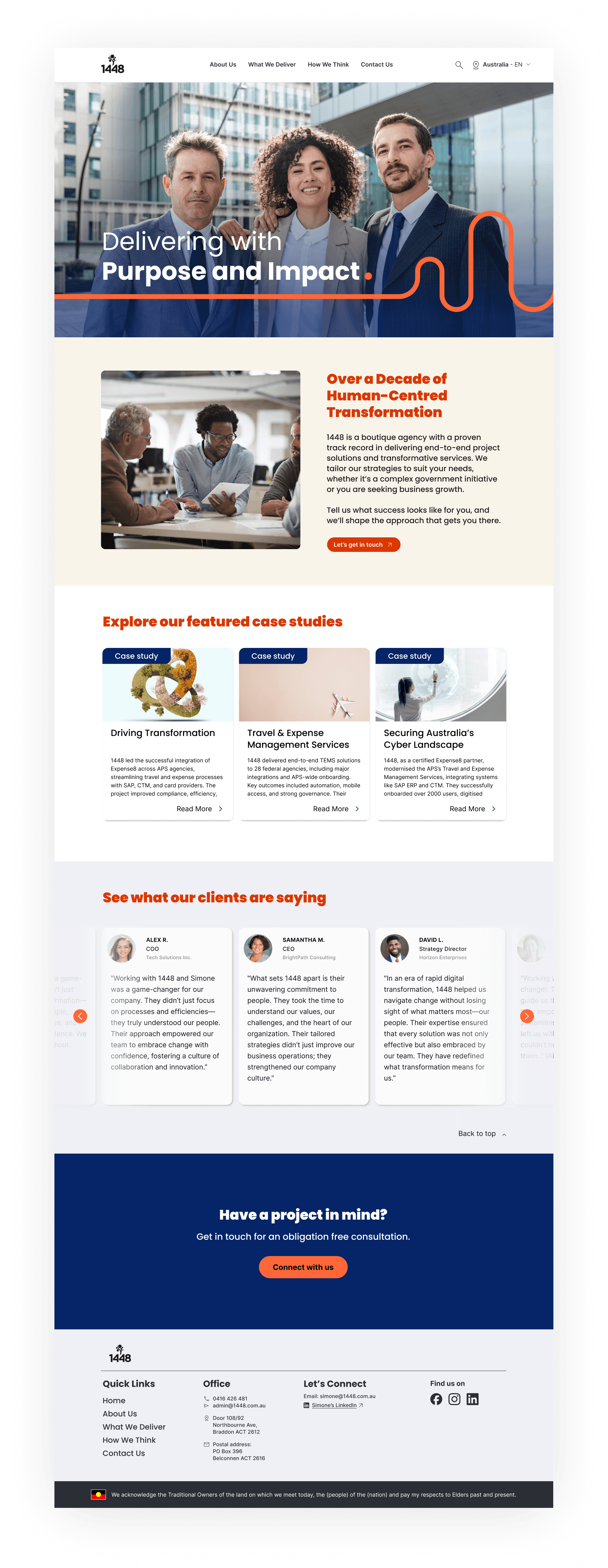
BEFORE: 1448's existing website served little purpose and lacked engagement.

Ideation
Following the research handover from the UX team, I stepped into the role of UI Designer, translating insights into structured layouts, scalable components, and accessible, high-fidelity pages aligned with 1448’s evolving brand and goals.
Based on user needs and expectations uncovered through research, our team explored the following HMW questions to guide our design approach:
Ideation
Guided by the How Might We questions, the team brainstormed topics that aligned with 1448's goals. These ideas were grouped into categories that would eventually shape the refreshed website structure.
Using the Crazy 8s method, the team also generated feature ideas. These were organised into a value-effort matrix to help prioritise what would be included in the MVP.
A few high value, low effort features were selected for inclusion:
Client testimonials to build credibility
Charity support to reflect the company’s human centred values
Evidence based client outcomes, presented through metrics
Greater visibility of Simone (CEO) to highlight leadership and expertise
A clear display of company values to reinforce brand identity
Card sorting topics into categories that would form pages.

Ideas are evaluated against a value-effort matrix.

Defining Information Architecture (IA) and Strategy
With our key themes, MVP features, and user needs identified, we began shaping the website’s structure and strategy. This phase focused on turning research insights into a user-centred experience that clearly communicates 1448's value.
To do this, we:
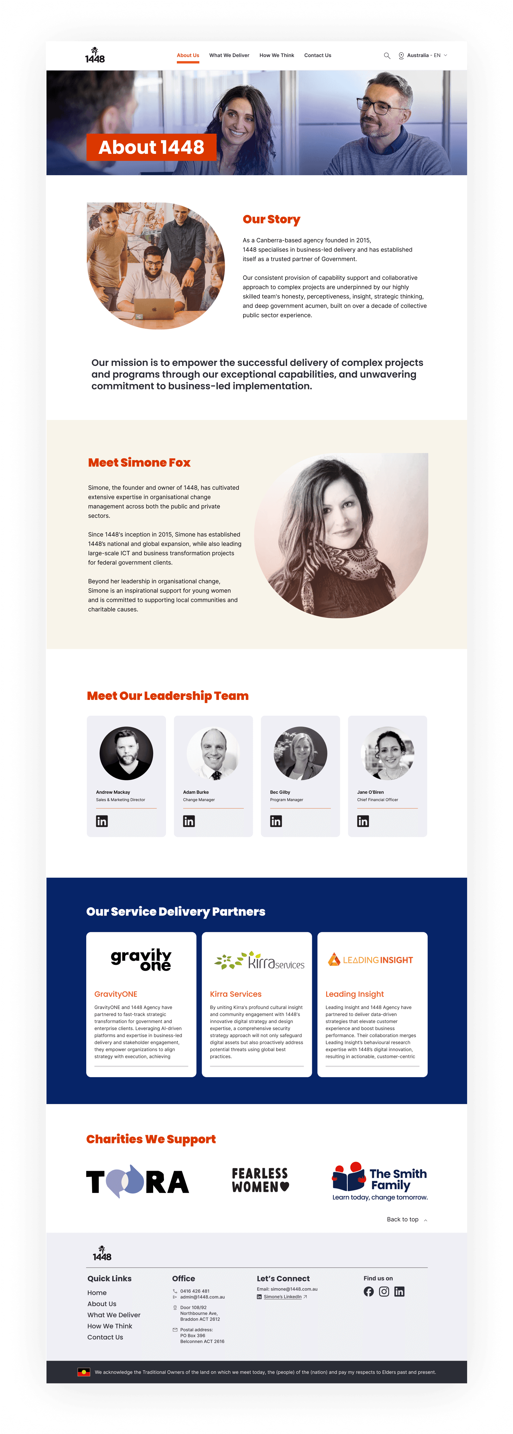
Reorganised the information architecture around core user needs, focusing on areas such as About Us, Services, Case Studies, and Contact Us pages.
Developed clear user flows to guide different audience types toward relevant information and contact points.
Prioritised evidence-first content, including client impact stories and testimonials, to build credibility and trust.
Created low-fidelity wireframes to visualise the structure early and gain stakeholder alignment before progressing to visual design.
Information Architecture of website.

User flow chart designed to account for different user groups.

After aligning on the information architecture and strategy, I designed high-fidelity mockups for key pages and developed a modular design system to ensure consistency and scalability across the site. WCAG accessibility best practices were applied throughout, including contrast checks, focus states, and clear type hierarchy. Following this, we conducted remote usability testing with desktop users and refined the prototype based on their feedback.
Early design system built for future scalability.


Outcome
Improved trust and discoverability through clear visual hierarchy and evidence-led content.
Scalable, accessible design system ready for future growth.
A more authentic reflection of 1448’s professionalism and values.
Testimonial
"Over a fast-paced four-week sprint, the team stepped up and exceeded expectations. They delivered valuable insights to inform the structure and design of our future site, while also prompting us to rethink our broader brand direction, and providing some great recommendations for us to take forward and consider.
We appreciated how the team brought us on the journey, exploring theories, testing ideas with users, and refining concepts. Their work included competitor analysis, desktop reviews, stakeholder interviews, user testing, culminating in a cohesive discovery report, user personas, a draft design system, proposed information architecture, and an optimised Figma prototype.
We’re incredibly grateful to the team for their professionalism, creativity, and clear passion. Their final presentation was outstanding - well coordinated and delivered."
Andrew | Director of Sales and Partnerships | 1448 Agency
Future Recommendations
Use brand images instead of placeholders
Refine content to better reflect 1448’s voice and services
Test with real users including clients
Add intro video to highlight brand and leadership
Explore improved navigation with dropdowns for services and case studies